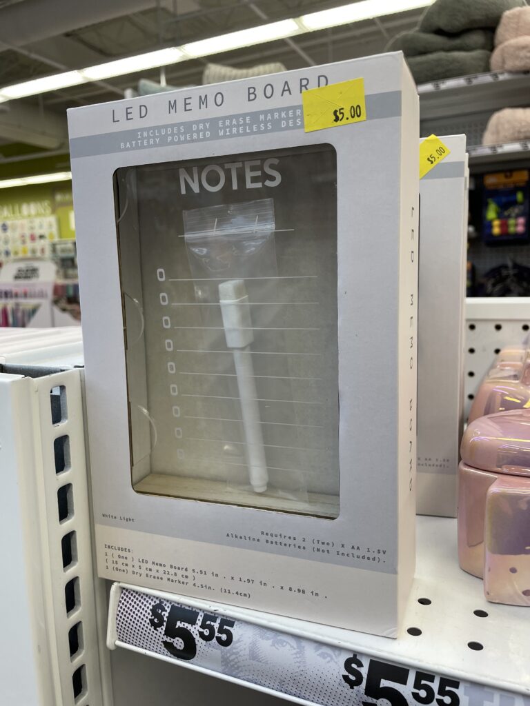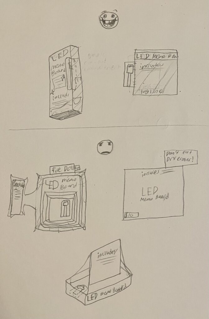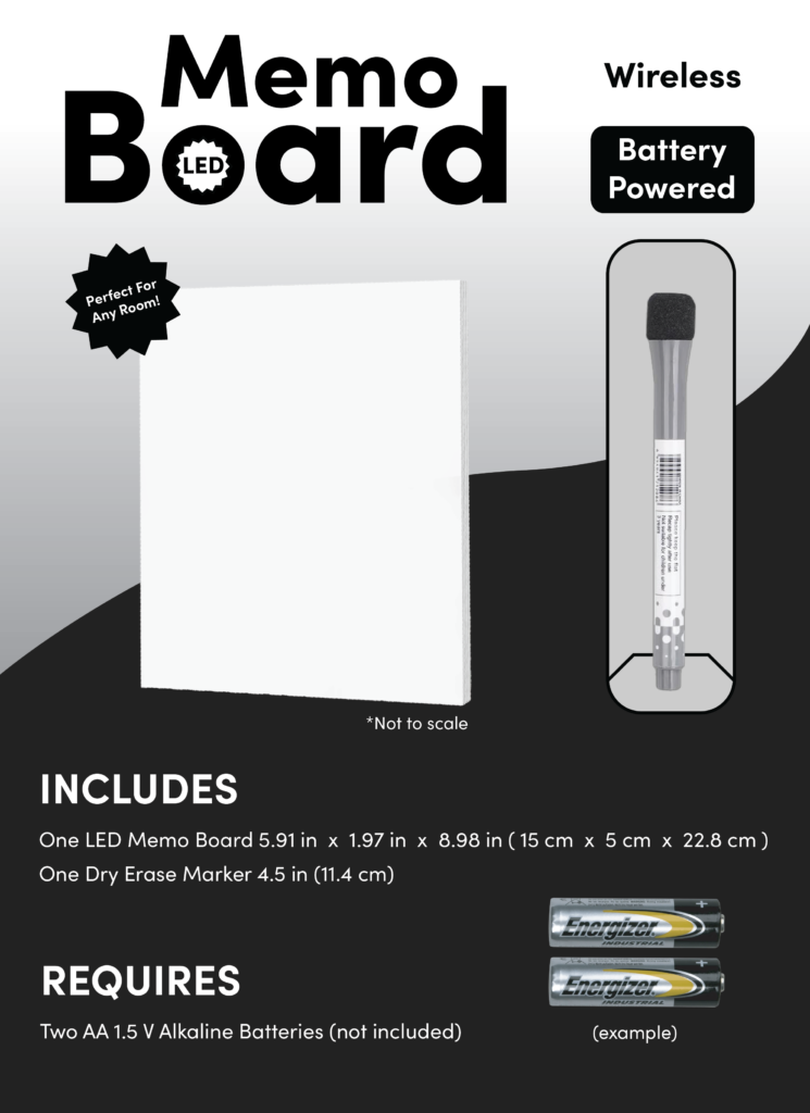


This is a memo board that I thought was not only bland and uninteresting, but wasteful, as there is an unneeded plastic wrapping around the included dry eraser. I thought it could a little “makeover” so I devised some concept sketches of plausible re-designs for the board. The top sketches are the contenders and the bottom ones are the failures (which are comically hypothetical). The first part of my process was to find a good balance. One of my main gripes with the original design is the lack of UI/UX. My fix for this problem, and by extension the plastic problem was to simply have the board be displayed on the box’s cover with a small compartment for the dry-eraser next to it. This removes the massive see-through window that not only wastes less plastic and enables more UI/UX opportunities. Another issue I had with the original was that the text was small and hard to read. My fix for this issue was to do something very unpredictable. I made the words bigger. What is included and required as well as how the board works is now easier to see. I found this to be a very interesting case study as it challenged my problem solving and graphic design skills.
