
Coffee Shop UX/UI Project
In this assignment, I was tasked with rebranding a coffee shop of my choosing to make it stand out from the competition. In order to do this, I needed to know who my competition even is, and how I can offer something that nobody else is.

Commercial Coffee Competitive Content Analysis
Dunkin’ and Starbucks are the “titans” of the industry for a reason. In order to figure out how to make sure my own coffee shop doesn’t flop, I’ll need to find what makes the two places so successful in the first place.
Commercial Coffee Competitive Content Audit
Dunkin’ Donuts’ personality is casual, energetic, and down-to-earth. It emphasizes convenience and affordability, appealing to those looking for a quick coffee fix or a tasty treat.
Starbucks’ personality can be described as warm, inviting, and community-oriented. They emphasize a sense of belonging and connection, often positioning themselves as a home away from home.
Target Coffee Shop Content Audit
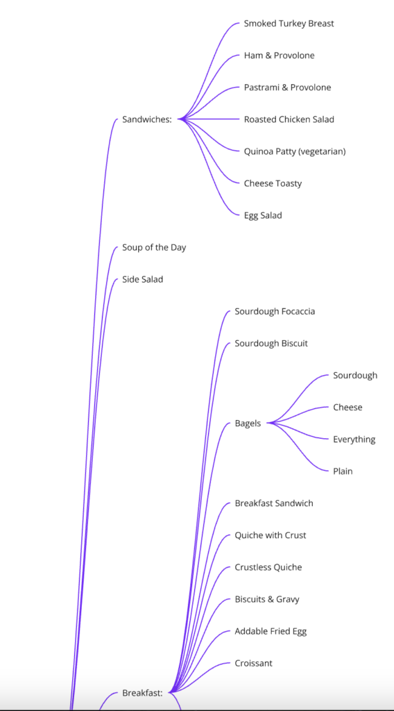
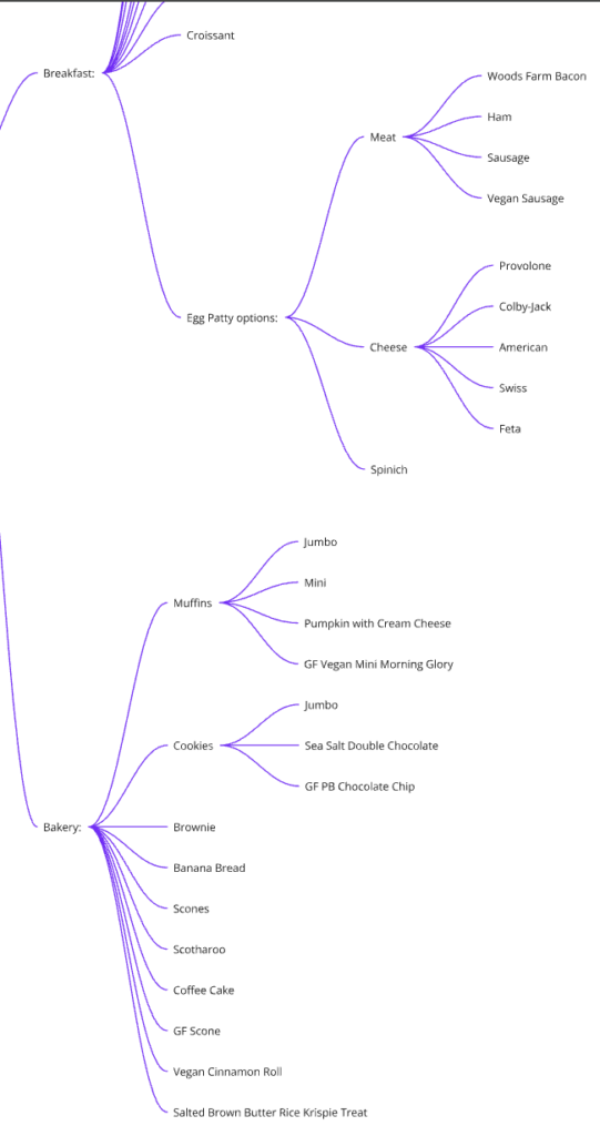
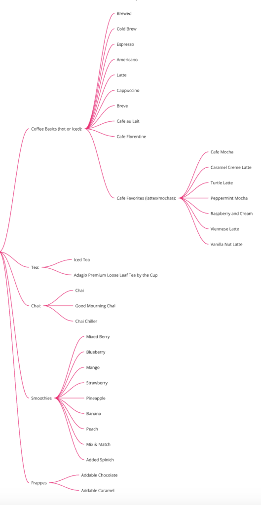
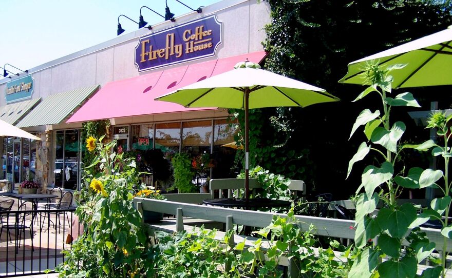
Firefly is a coffee house that serves not just coffee, but also a variety of soups, sandwiches and pastries. They are located at 3523 North Anthony Blvd. Fort Wayne, IN 46805. Their primary customers consist of coffee enjoyers as well as students and teachers alike. The place also bars the attention of tourists and local residents. Firefly is near Concordia Lutheran High School as well as Holy Cross Lutheran Church and School, which would explain the number of students and teachers as mentioned earlier.
Value Prop Canvas
Target Value Proposition

Analysis
I found that “Targeting your audience” and “Planting the conversation” are quite effective methods of improving brand loyalty and reach. Catering to your target audience is one of the best ways to not only increase brand loyalty, but it can also encourage others to join as well. Similarly, creating an online movement of sorts to boost engagement is another great way to get more customers and to get the people talking.
Canvas
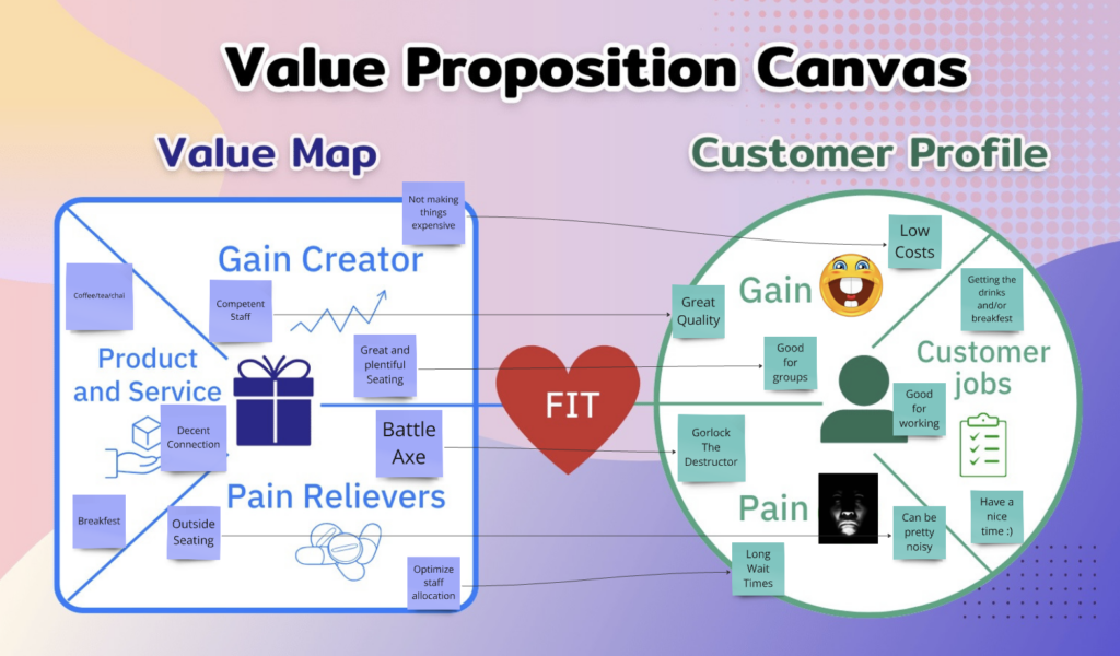
Firefly’s main selling point/product is handcrafted coffee, and they use their wide variety of specialty coffees and teas, as well as house-made baked goods and cured meats to stand out from competitors. Their purpose seems to be to share their passion for exceptional coffee, a love for people, a creative, supportive family customer and staff alike, and a desire to create a community gathering place in our own neighborhood.
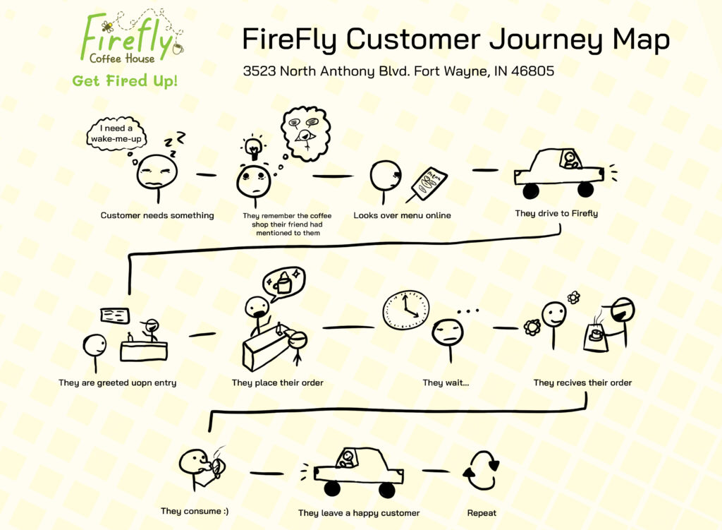
Target Persona Journey Map
Revised Value Proposition
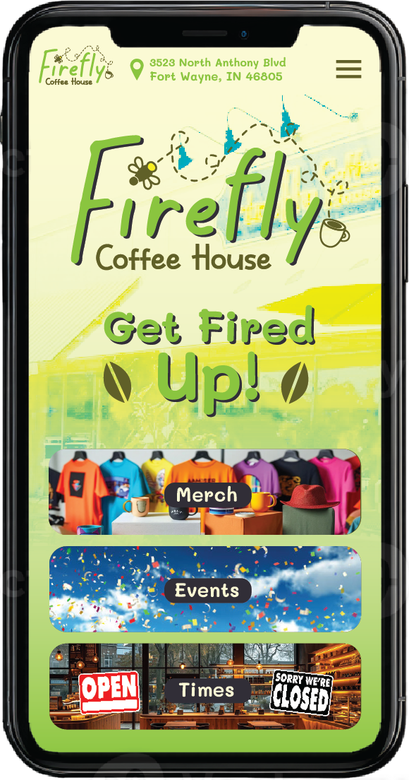
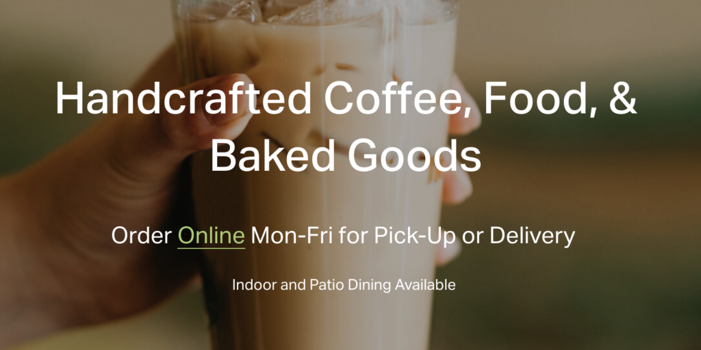
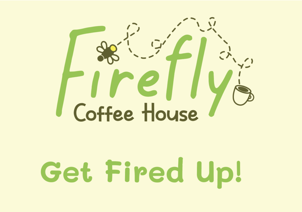
Something else I was tasked at doing for this assignment was to make a new slogan/value proposition for Firefly. While there isn’t anything wrong with their current one, it’s a bit of a “mouthful”. I decided to opt for a short but effective slogan that really gets the point across. Caffeine energizes people and gets them ready for the new day, and what better way to represent this than “Get Fired Up!”.
Old
New
Logo Evolutions

Old Logo
This is the companies current logo. A coffee shop is probably the last thing one would expect Firefly to be with the logo in it’s current state. There need to be more elements added in order to further cement the brand.
Sketches
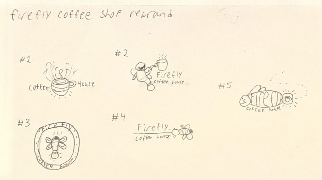
There were a lot of different logo variations that I came up with for the redesign. I had originally to make something similar to the original logo before I realized that it simply wouldn’t have worked out. I ended up merging some of these ideas together to create the final product.
New And Improved Logo
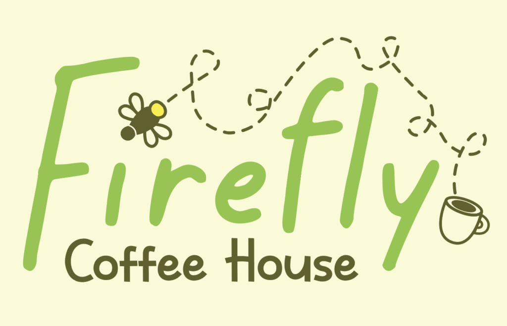
This was the final result of the redesign process. I decided to go for a more simplistic approach in order to make it give off a “home away from home” kind of vibe that the old logo didn’t quite have.
Merch

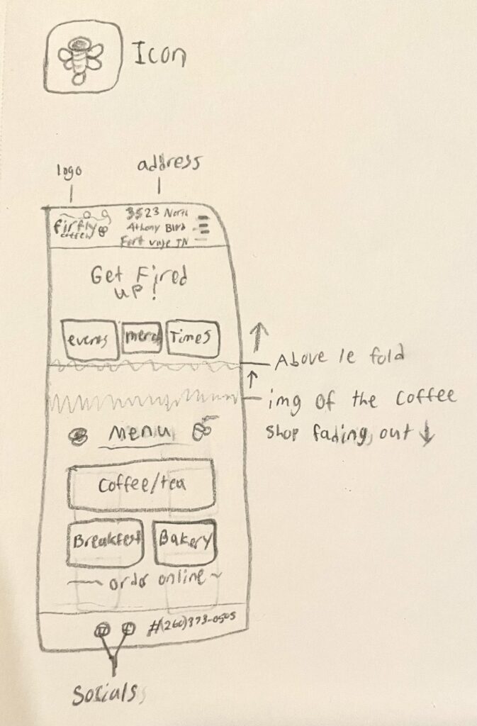
Mobile Website Wireframe
Mobile Website Prototype
