Personal Music Album Concepts

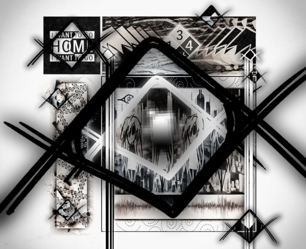
This is an “album cover” concept design for a story I’ve been working on. I’m not the best at making music right now, but once I get better, I may or may not use this officially. I didn’t have any particular inspiration for this piece—I just had the drive to do it one day and started crafting. I wasn’t very confident in it at first, but overtime throughout its production, I realized that I was worried for nothing. That’s why you should always strive to do things that you love or want to do even if you aren’t confident in yourself. You might just surprise yourself 😉 . Fun fact: The one of the characters featured in this piece is the oldest character I’ve made, dating all the way back to early 2020 (I’m ancient, I know). 
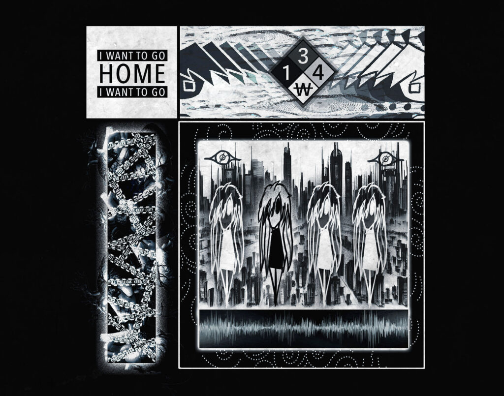
This is the standard version which would be used for almost every track (with some exceptions).

This version is the aforementioned exception and would be used for special songs/themes that have more importance for the story.

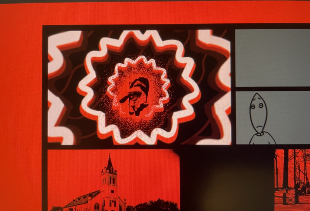
Since that piece had received a lot of positive reception from peers and followers alike, I was inspired to make another one based around a side story set in the same universe. I had a lot of fun making these, and for this piece, I’ve managed to find some early pictures of this piece’s development.
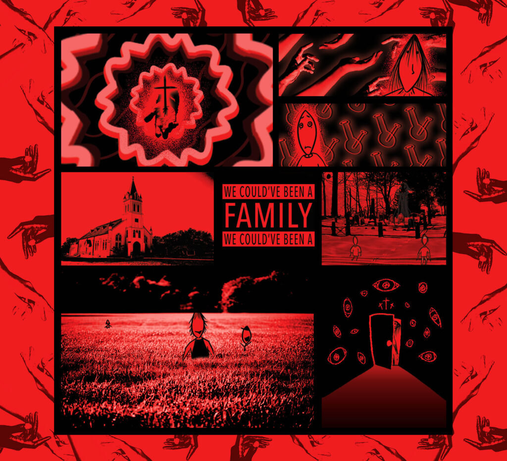
At this stage of development, I wasn’t sure how many shades of red I wanted to use. Originally, the top left section was going to be a much lighter (almost white) red until I realized that it would visually demand the viewer’s attention, which is not what I wanted.

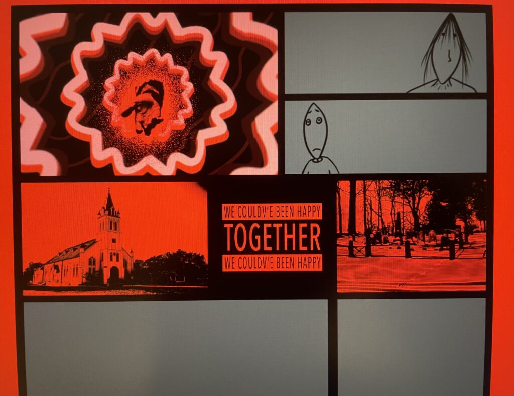
After finding the right color balance for the top left section I began to work on the middle. Usually, album covers have a “parental advisory” warning on them. This by itself wouldn’t make much sense for the purposes of this piece, as if I were to make music that featured this album it probably wouldn’t have any songs with lyrics. I then got a brilliant idea to put my own spin on it by having a general message relating to the characters shown. The reason the final version’s message is different is because I felt the old one was a bit “chunky” and hard to read, and I also felt like I could represent them better. It’s colors were originally the opposite with black on top and red in the middle, but this was disliked by myself and my friends so I changed swapped them.

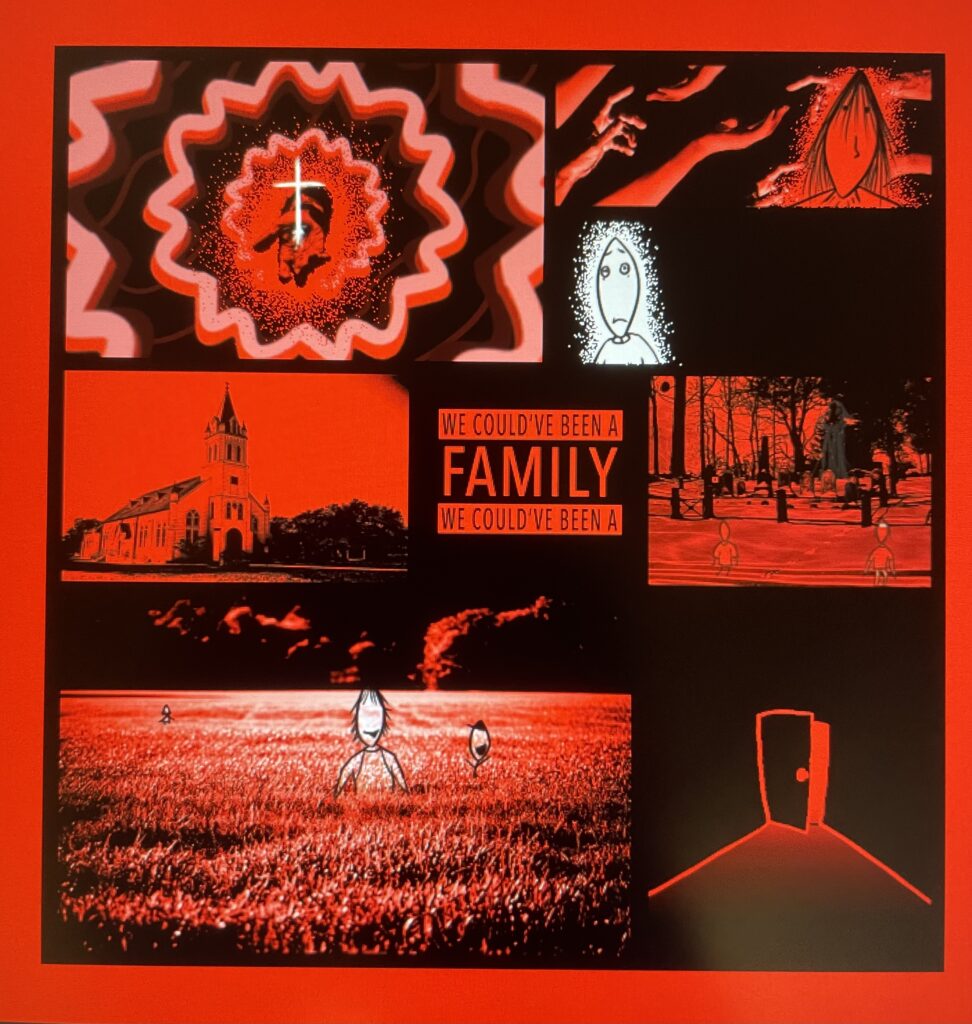
A LOT of decisions were made during the end of production that improved upon this a lot. Unfortunately this is the last photo I have of post-production so I try to go over everything I can.

I foolishly kept trying to add white to this piece in different areas as if I hadn’t learned my lesson the first time. This was aptly changed of course. I also thought that the outer edges could be a little more interesting so I added in the hands as another form of religious implication. I also added in a subtle drop-shadow to the background of the section on the top-right to add some depth. The only thing I wish I could’ve done differently about this piece is the color of the red in the final product. When running it through my editing software for some finishing touches, I ended up unintentionally drowning out the red from it and it makes me sad. For context, the red in the screenshots was what I was looking for.